
The Benjamin Moore Contemporary Color Palette
A breezy contemporary color scheme for interiors, this palette provides effortless color combinations that work wonders. Whether used in a loft, a kids’ room, a studio workspace or elsewhere, make this contemporary color palette yours!

White Heron
OC-57

First Light
2102-70

Violet Mist
1437

Heather Gray
2139-40
Maritime White
OC-5

Smoked Oyster
2109-40
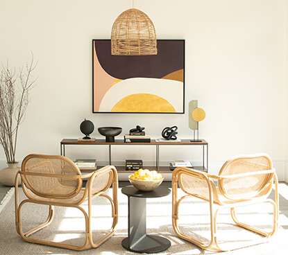
Art & Soul: Contemporary Color Goes Neutral
Neutral, greige and taupe paint colors keep the contemporary home warm and welcoming. Maritime White OC-5, a popular pale greige noted in our contemporary palette, is a favorite paint color pick for modern interiors.
Here, Glacier White OC-37—a favorite off-white for contemporary homes—lends a clean, calming canvas. Trendy rattan chairs add a casual, outdoors-in energy to the space. And the abstract artwork reflects the overall color scheme and minimalist aesthetic of modern design.
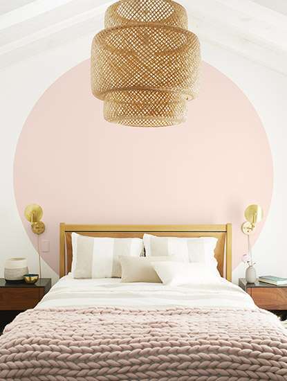
Tickled Pink (Paint): A Graphic Application
Ever-optimistic, pink paint is a signature color of the millennial home.
In this cheerful yet elegant bedroom, a playful, soft pink-painted halo in First Light 2102-70—the Benjamin Moore Color of the Year 2020—reimagines the accent wall. Cool, crisp White Heron OC-57-painted walls and ceiling provide perfect contrast.
Balancing the youthful vibe of the bedroom, gilded home accessories add a luxurious tone to the space.
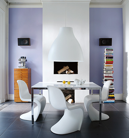
The Case for Vibrant Color
With it’s wide range of expressive paint colors, the Color Preview® Color Collection offers an essential palette for homeowners who want vibrant color in their home. Here Color Preview’s violet Enchanted 2070-50 adds the right amount of whimsy to cool, Ice Mist OC-67-painted walls. Looking for a softer lavender? Try dreamy Violet Mist 1437.
Midcentury-inspired furniture mixed with sleek industrial elements in this dining area creates a stylish space. Of course, smart home accessories are in the mix—an essential of today’s contemporary home.
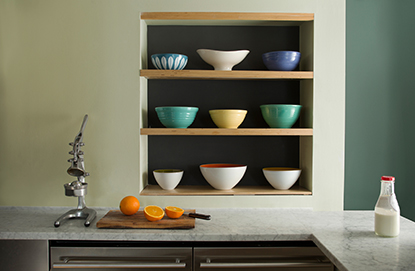
Contrasting, Yet Cohesive Paint Colors
Unexpected color combinations are always refreshing.
Here, a muted kitchen wall in soft pastel Lime Sherbet CSP-845 frames deep Yorktown Green HC-133 inset shelving. The back wall, in Covington Blue HC-138, offers a modern, yet practical take on color blocking.
Other modern takes on earth tones that we love include Heather Gray 2139-40 and Smoked Oyster 2109-40.
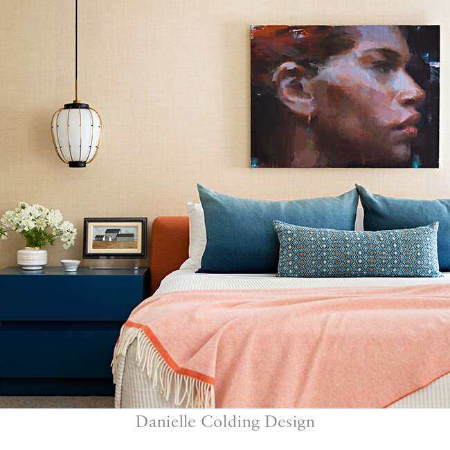
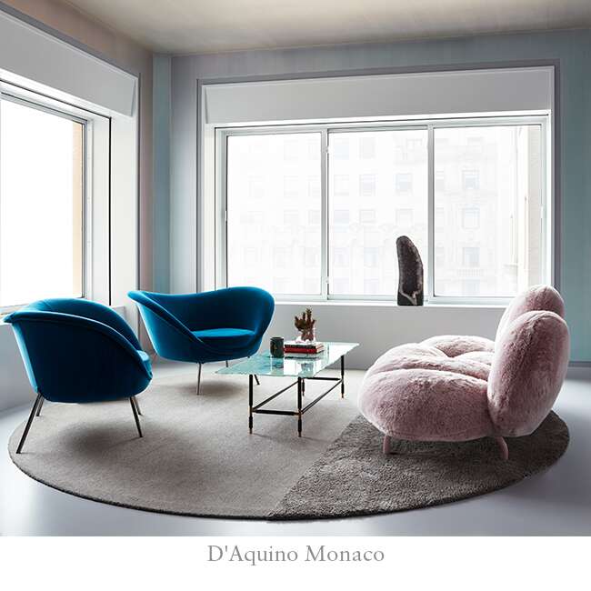
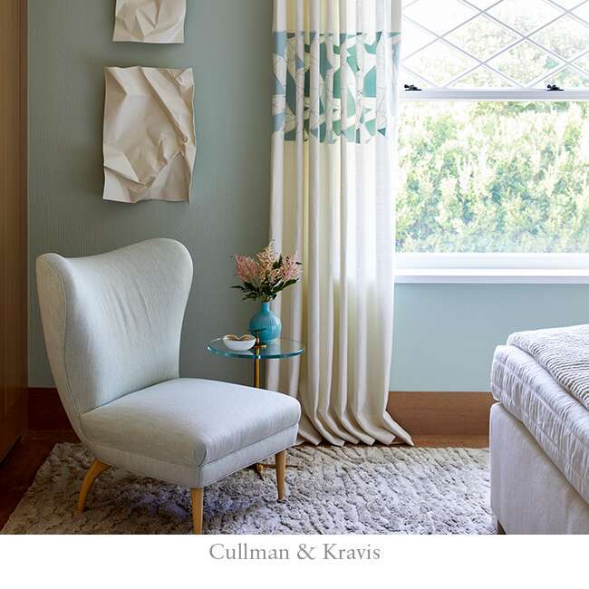
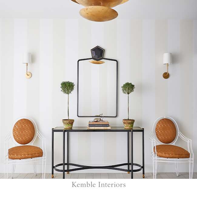
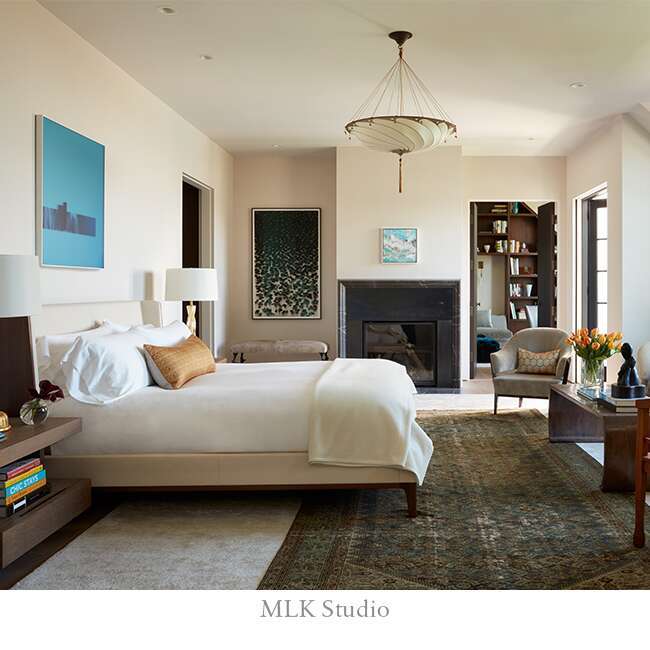
Designer Snapshot: Contemporary
See how interior designers from Benjamin Moore Design P.O.V. curate contemporary style in each of these distinctive rooms.