
If the allure of onyx, ruby, emerald and other bold, saturated hues has caught your eye, this palette makes it easier to dive in.
Explore the design impact–both big and small–darker shades can have on your home.

The Color Palette
This palette of 23 colors was hand-selected to interact seamlessly. Mix, match and put the power of the Benjamin Moore Color & Design team to work for you.

Pink Bliss
2093-70

Chalk White
2126-70

Iceberg
2122-50

Wish
AF-680

Cloud Cover
OC-25

Amulet
AF-365

Etruscan
AF-355

Stormy Monday
2112-50

Sandlot Gray
2107-50

Porcelain
2113-60

Wet Concrete
2114-40

Sea star
2123-30

Sea Life
2118-40

Shadow
2117-30

Dark Burgundy
2075-10

Knoxville Gray
HC-160

Guacamole
2144-10

Grandfather Clock Brown
2096-30

Dinner Party
AF-300

Salamander
2050-10

Gentleman’s Gray
2062-20

Night Shade
2116-10

Ebony King
2132-20
The Multi-Faceted Nature of Deeps
Deep colors bring a sense of drama to any room. But what about the softer side?
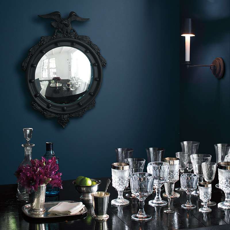
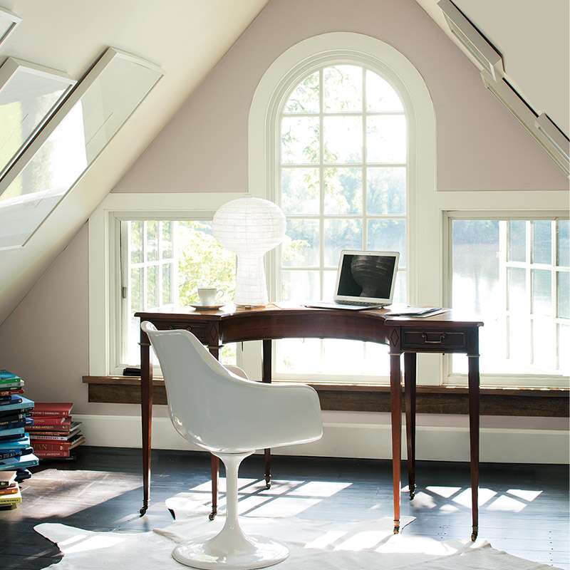
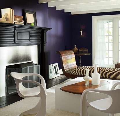
When it comes to darker colors, light is a powerful protagonist. Deeply-hued rooms with skylights, French doors, or any level of ambient light help to enhance deep colors, creating an intriguing interplay of light and dark.
Take the gray undertones of Shadow 2117-30–our Color of the Year 2017–for example: The purple hue responds more like a neutral under the influence of natural light. As the day gets darker, Shadow deepens, adding more intensity to the room. Wet Concrete 2114-40 has a similar effect.
Test the Waters
Saturated, rich colors are an easy choice for those who have a proclivity for them in the first place. If you are new to deeps, you may want to start small:
-
Embolden a project– Paint the inside of your book shelves or a small powder room with deep hues–they’re perfect projects for testing out stronger shades.
-
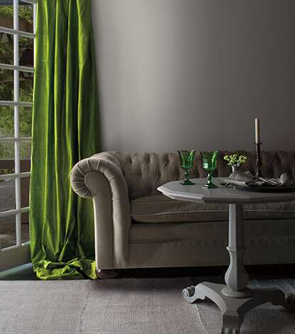
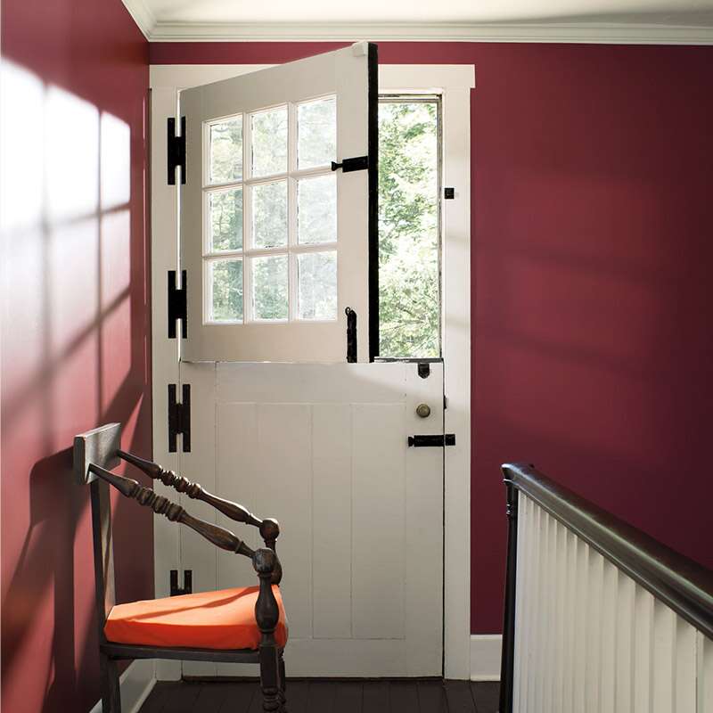
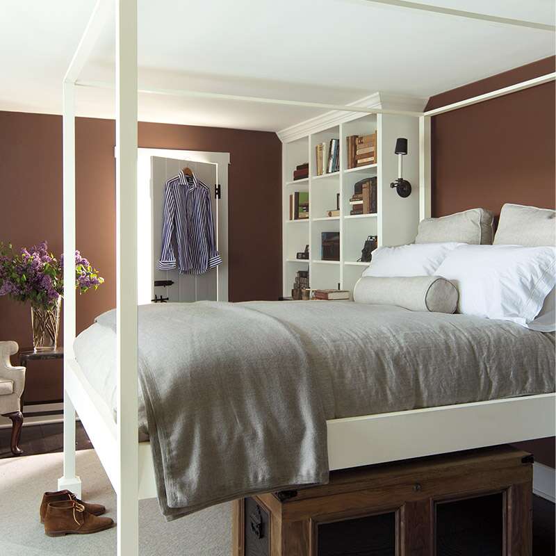
Use a bold stroke– Add some punch to a flight of wooden stairs with a banister in Night Shade 2116-10 or risers in Salamander 2050-10. Or test the waters on a smaller-scale accent wall as seen here.
-
Look inside– Are deep colors in your wardrobe? In your jewelry box? Pay attention to your personal color palette.
Elaborate
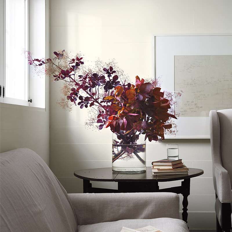
If you choose deep colors on the majority of a room’s walls, fabrics like velvet or brocade provide both balance and dimension. Consider fabrics in lighter shades for an appealing contrast against more intense colors.
Metallic also work wonders against deeps, bringing reflection and energy into a deeply-hued room. Bronze picture frames, sterling silver candlesticks or a polished chrome lamp add iridescence and reflection.
Pair with Your Choice of Product
Colors mentioned here are available for use in a range of Benjamin Moore paints. Explore the product that’s right for you in The Right Paint or Stain for your Project section.